Graphing Point Mutations
To illustrate gTrack’s functionality in graphing point mutations, a data set of sequences is created and a few of them will are picked as variants. This data will be graphed and because there are outliers (variants), they will be easily visable. This vignette also exemplifies how/when to use the gTrack name parameter.
name Parameter
## create sequences from chromosomes 1-3.
fake.genome = c('1'=1e4, '2'=1e3, '3'=5e3)
tiles = gr.tile(fake.genome, 1)

## Choose 5 random indices. These indices will store the variants.
hotspots = sample(length(tiles), 5)

## for each sequence, calculate the shortest distance to one of the hotspots.
d = pmin(Inf, values(distanceToNearest(tiles, tiles[hotspots]))$distance, na.rm = TRUE)
## for sequences near the hotspots, the "prob" will be a higher positive number. It becomes smaller as it moves farther from the hotspot.
prob = .05 + exp(-d^2/10000)
## sample 2000 of the sequences. the one nearer to the hotspots will "probably" be selected.
mut = sample(tiles, 2000, prob = prob, replace = TRUE)
## Error in sample.int(length(x), size, replace, prob): incorrect number of probabilities
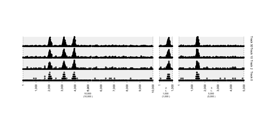
## graph with different degrees of stack.gap. The higher numeric supplied to stack.gap helps separate the data, visually.
gt.mut0 = gTrack(mut, circle = TRUE, stack.gap = 0, name = "Track 0")
gt.mut2 = gTrack(mut, circle = TRUE, stack.gap = 2, name = "Track 2")
gt.mut10 = gTrack(mut, circle = TRUE, stack.gap = 10, name = "Track 10")
gt.mut50 = gTrack(mut, circle = TRUE, stack.gap = 50, name = "Track 50")
win = si2gr(fake.genome)
plot(c(gt.mut0, gt.mut2, gt.mut10, gt.mut50), win)
plot of chunk mutations2-plot