Customizing a Small Data Set
In this vignette, examples of how to segment a data set such as a single GRanges object, how to specify the y-axis of a graph, how to color that same graph, how to add a color to each unique value will be shown.
gr.tile(gr , w) - Divide GRanges into tiles of length “w”
## DO NOT FORGET TO LOAD gUtils library.
library(gUtils)
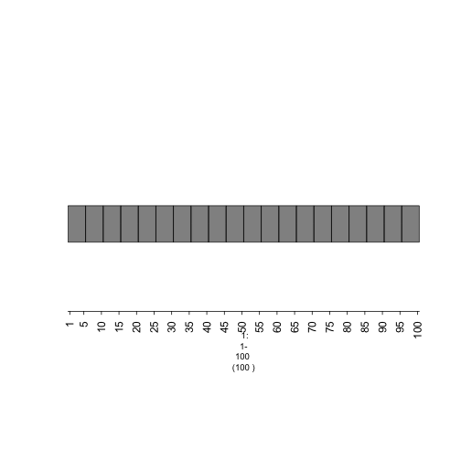
#The only interval in this GRanges object has a range of length 100, it'll be divided by 5 and thus, 20 tiles of length 5 will be returned.
gr <- gr.tile(GRanges(1, IRanges(1,100)), w=5)
## Plot tiles
plot(gTrack(gr))
plot of chunk plot-tiles
gTrack(gr + n) - Extend each range by “n” base pairs
plot(gTrack(gr+5))
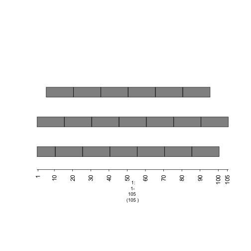
plot of chunk plot-overlappingtiles
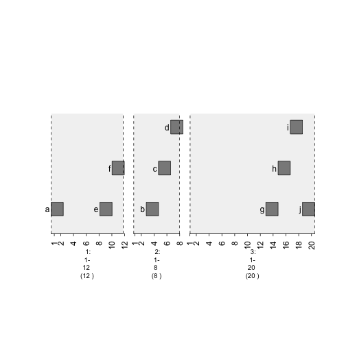
stack.gap - Specify degree of spacing(in x-direction) between ADJACENT tiles.
gr <- GRanges(seqnames = Rle(c("chr1" , "chr2" , "chr1" , "chr3") ,
  c(1,3,2,4)), ranges = IRanges(c(1,3,5,7,9,11,13,15,17,19) , end =
    c(2,4,6,8,10,12,14,16,18,20), names = head(letters,10)), GC=seq(1,10,length=10), name=seq(5,10,length=10))
plot(gTrack(gr))
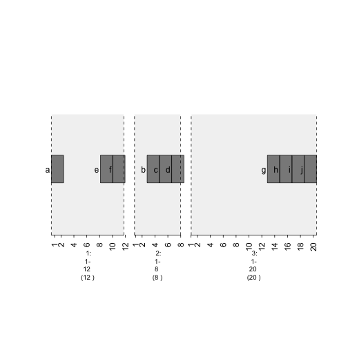
plot of chunk plot-gr
plot(gTrack(gr , stack.gap = 2))
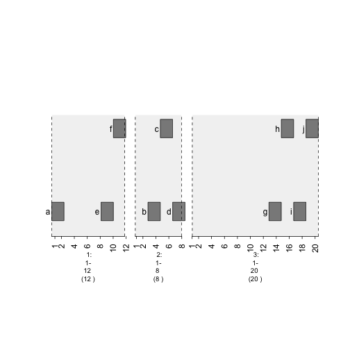
plot of chunk plot-stack.gap2
plot(gTrack(gr , stack.gap = 3))
plot of chunk plot-stack.gap3
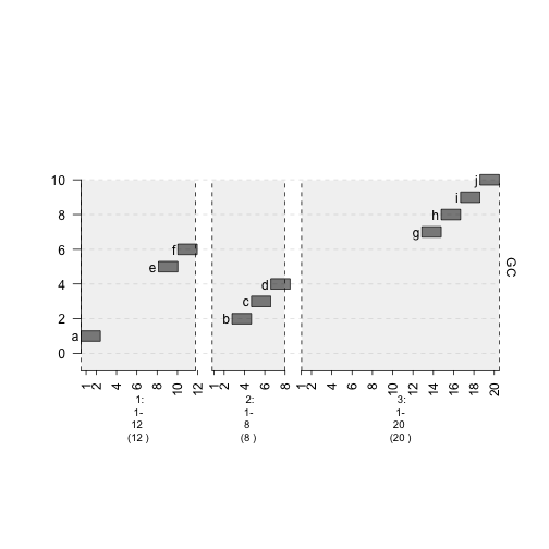
bars - Plot data points as vertical bars
gTrack(gr , bars = TRUE/FALSE)
plot(gTrack(gr , y.field = 'GC' , bars = TRUE , col = 'light blue'))
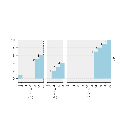
plot of chunk plot-bars
lines - Plot data points as lines.
gTrack(gr , lines = TRUE/FALSE)
plot(gTrack(gr , y.field = 'GC' , lines = TRUE , col = 'purple'))
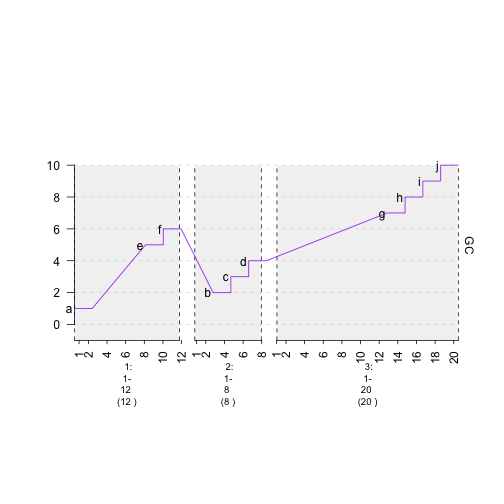
plot of chunk plot-lines
circles - Plot data points as circles.
gTrack(gr , circles = TRUE/FALSE)
plot(gTrack(gr , y.field = 'GC' , circles = TRUE , col = 'magenta' , border = '60'))
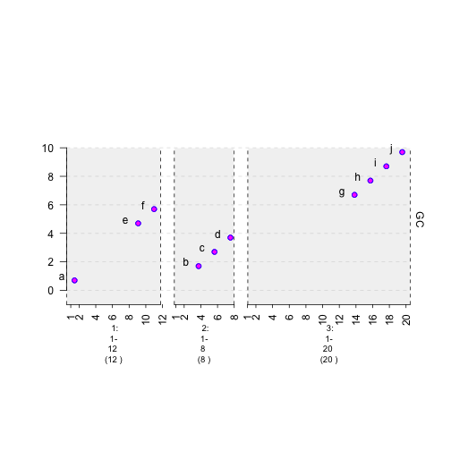
plot of chunk plot-circles
colormap - Specify mapping of colors to values.
plot(gTrack(gr , y.field = 'GC' , bars = TRUE , col = NA , colormaps = list(GC = c("1"="red" , "2" = "blue" , "3"="magenta", "4"="light blue" ,"5"="black" , "6"="green", "7"="brown" , "8"="pink", "9"="yellow", "10" = "orange")) ))
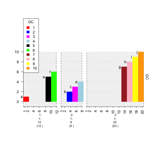
plot of chunk plot-colormap
gr.colorfield - Automatically specify mapping of colors to values.
plot(gTrack(gr , y.field = 'GC' , bars = TRUE , col = NA , gr.colorfield = 'GC'))
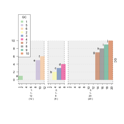
plot of chunk plot-gr.colorfield
gr.labelfield - Plot values for each data point.
plot(gTrack(gr , y.field = 'GC' , bars = TRUE , col = NA , gr.colorfield = 'GC' , gr.labelfield = 'name'))
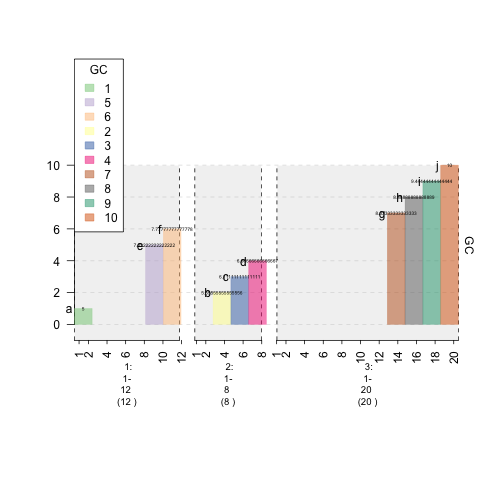
plot of chunk plot-labelfield